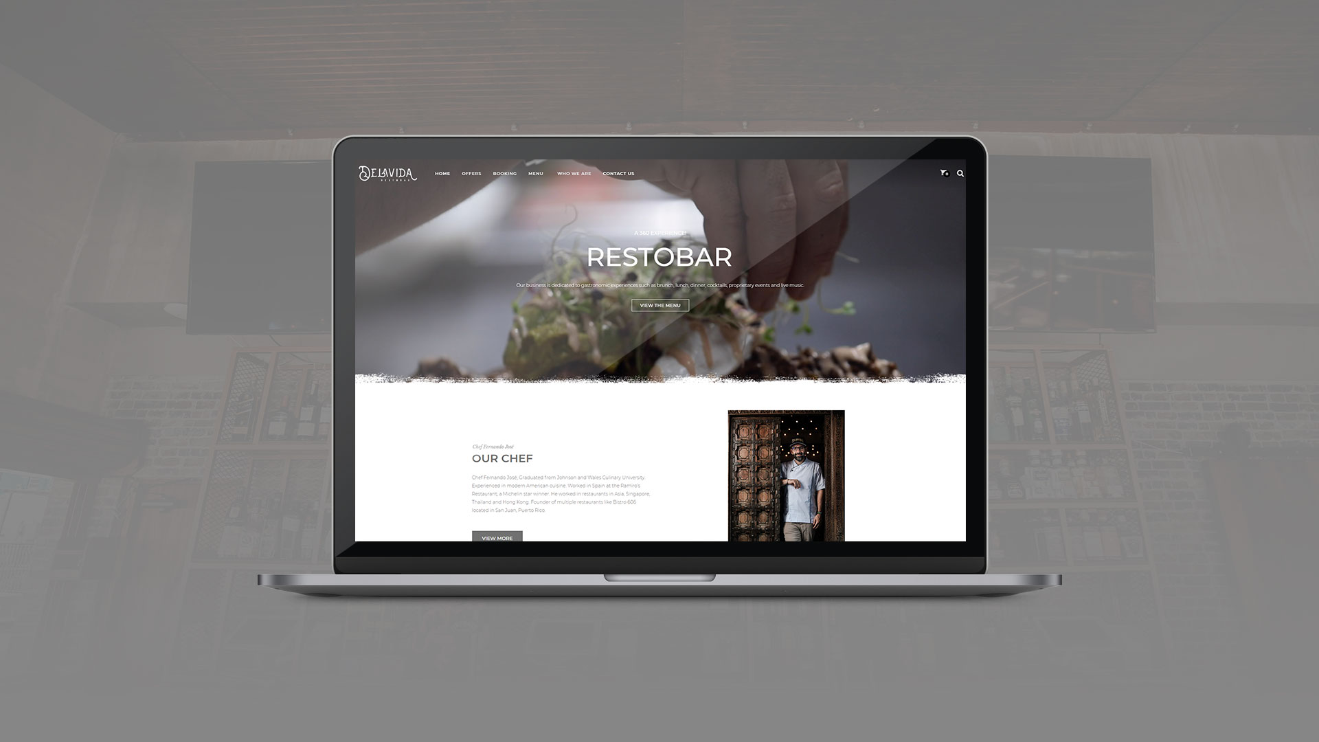
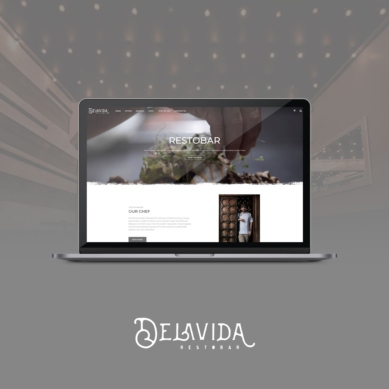
Delavida Restobar, a restaurant located on Calle Loíza in San Juan, Puerto Rico, was looking for an online presence that reflected its exquisite gastronomic offering and cozy atmosphere. In collaboration with Blue Morpho Creative and his team, Jomar Cruz Creative Designer developed a dynamic and functional website.
Service
Web Development
Website
delavidarestobar.com
Industry
Gastronomy
An attractive and visually stunning homepage that captures the essence and atmosphere of Delavida Restobar. It has a presentation of the monthly offers of featured dishes and upcoming events.
Likewise, it has a section dedicated to telling the story of its Chef Fernando José and Delavida Restobar, its vision and its commitment to gastronomic excellence and customer service. Gallery of images showing the atmosphere of the restaurant were integrated.
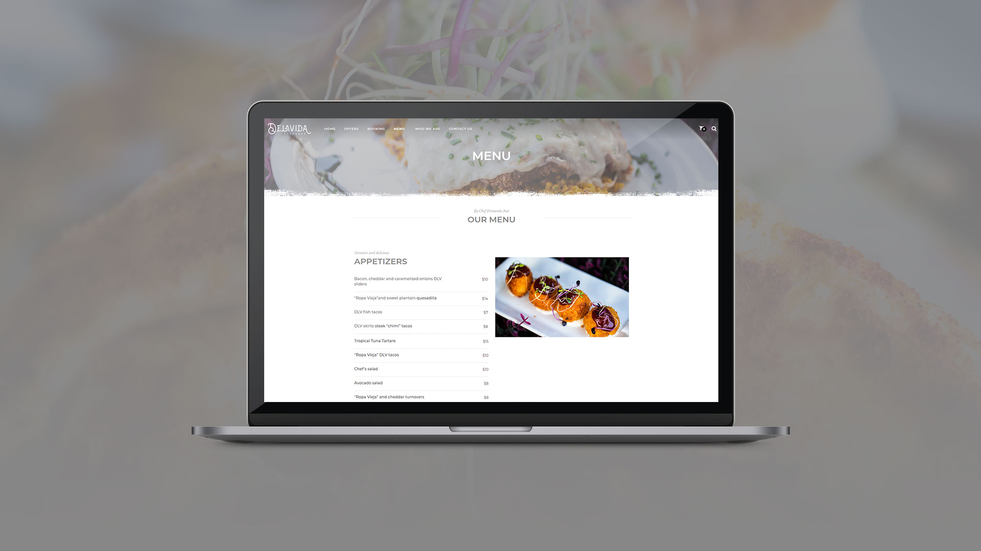
Detailed presentation of the varied Delavida Restobar menu, highlighting the exclusive dishes created by Chef Fernando José. Integration of high-quality images to visually illustrate each dish and whet the appetite of site visitors.
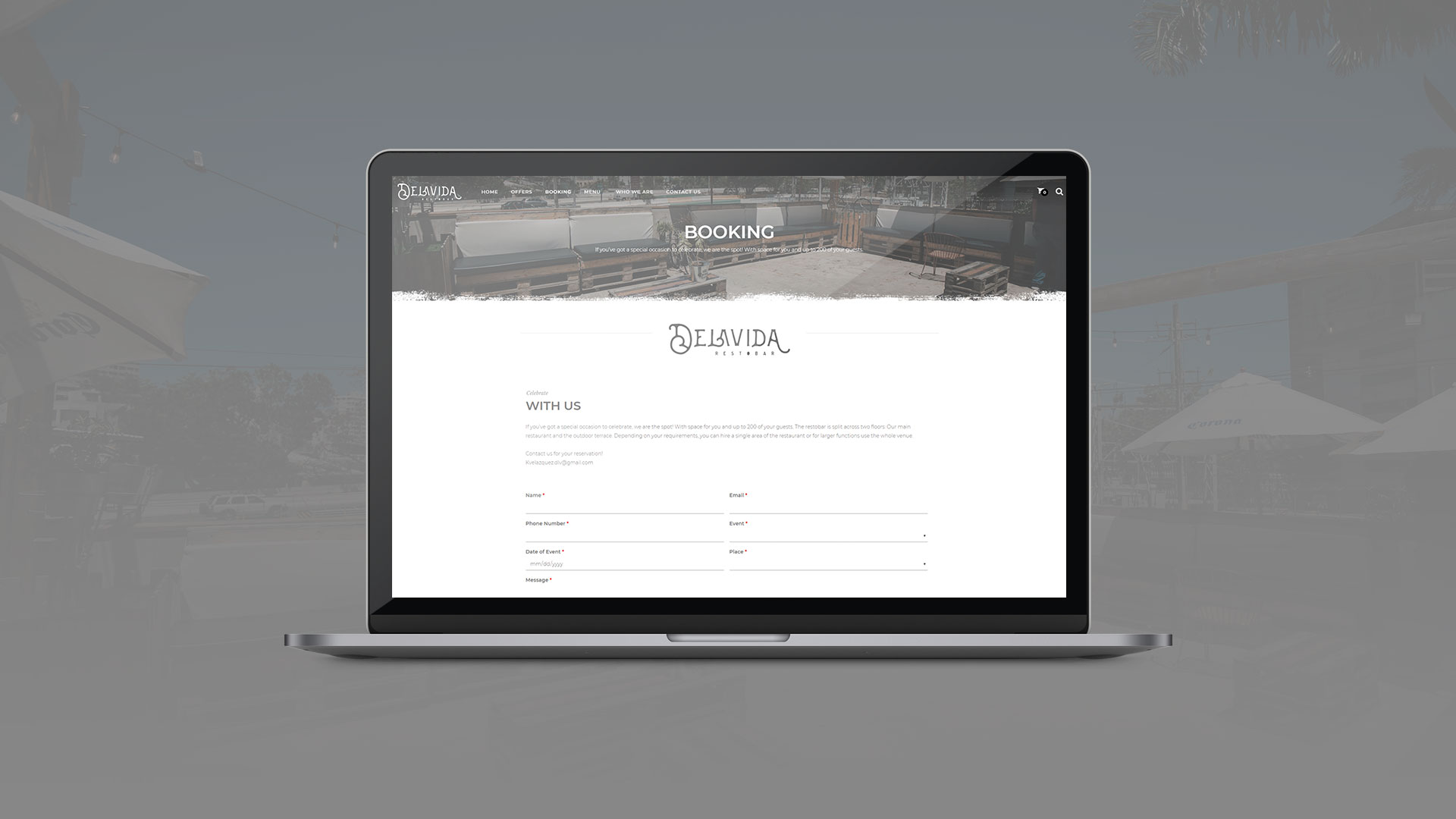
Online reservation system that allows customers to reserve a table at the restaurant conveniently and quickly. Integration of functionality for the purchase of special monthly dish offers directly from the website. Integration of SEO elements to improve visibility in search engines and increase organic traffic to the website.